This magazine advert includes lots of promotional information. However it has been designed in a way to make the powerful image clearly visible and for the advert to not appear cluttered or over whelming. This appeals to the audience as the image is very eye catching and then the next thing that you see is the text. The clear layout of the text makes the reader more likely to be engaged and read it all as it is enough to spark interest but doesn't over crowd the page.
CD digipak front cover
Back and Inside
The disk
Adele - 21 - digipak and magazine
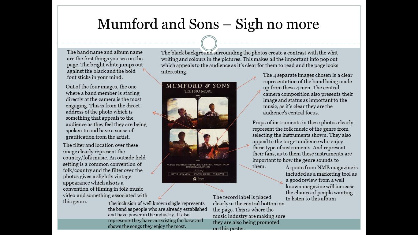
Album front cover
Magazine advert
Album back
Disk
There is synergy between the magazine advert and album covers, with the music video of someone like you. This is one of the biggest singles that was released before this album. There is similar shots of close ups of Adele showing her sadness and emotion of the song, as there are on the covers. She also has her signature hair and makeup look throughout this video,which she then became very recognized for on the 21 promotional imagery. Lastly, the most obvious synergy is the continuation of the black and white in the music video, which makes the audience create visual links with the images shown above.


Comments
Post a Comment